|
|
| |
The most popular national-debt web sites continue the same confusions that caused Reagan to believe the national debt was higher than ever when it was at its lowest point since before World War II. Here is what you see when you look at the debt in nominal dollars.
|
|
| |
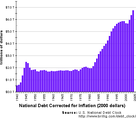
The misleading nominal-dollar graph shown above comes from the Brillig site. That site has been reminded (via email) of the effects of inflation and as a result has corrected for it by adding the following graph. But this graph still ignores population growth and the fact that the country has gotten a lot richer in the last 50 years. The result is still tremendously misleading, but at least now you can see the Reagan rise and the Clinton dip. National Debt |
|
| |
The nominal Gross Domestic Product (GDP) takes all of these effects into account. It grows with inflation, population and increased income. By comparing the national debt to GDP, we get a fair check on whether it is growing or shrinking relative to what we can afford. That is why the White House web site give gross national debt as a percentage of GDP, which is what I have plotted on the page above.
|
|
http://zfacts.com/p/55.html | 01/18/12 07:16 GMT
Modified: Fri, 10 Sep 2010 03:34:07 GMT
|