|
http://zfacts.com/p/746.html
|
Explanation of "Normalized Non-Payroll Jobs" |
|
|
|
| |
How Non-Payroll Jobs are Normalized
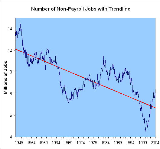
In the graph above, the blue line shows the number of non-payroll jobs from 1948-2004. This number decreased over time as more people moved to company payrolls. The red trendline shows the expected number of non-payroll jobs if they were to decrease over time in a straight line. In statistics parlance this is called the ordinary least suares Line or a linear regression line.
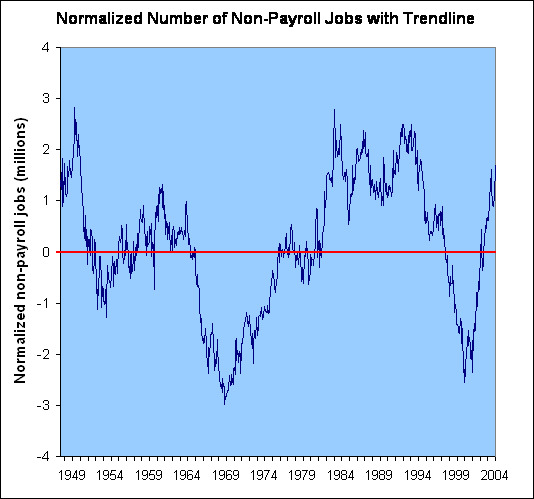
The purpose of "normalizing" is to get rid of the historical downward trend in non-payroll jobs so that we can compare the number of non-payroll jobs to official unemployment. To "normalize" the line we rotate both the trendline and the number of non-payroll jobs upwards so that the red trendline is horizontal. This is shown in the graph below. The normalized line shows the amount of deviation between the actual number of jobs (in millions) and what was expected by the historical trendline.
For example, in the graph above the actual number of non-payroll jobs was about 8.4 million in January 2004, but the red trendline would expect about 6.75 million non-payroll jobs. The normalized number of non-payroll jobs shows that the difference between these actual and expected number of non-payroll jobs is about 1.65 million.
|
|
http://zfacts.com/p/746.html | 01/18/12 07:30 GMT
|
|